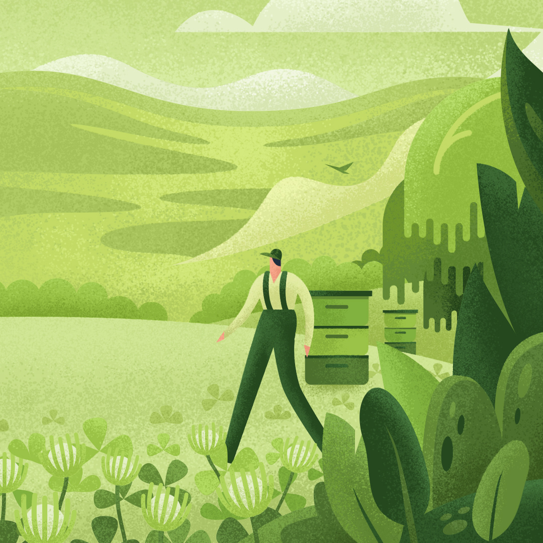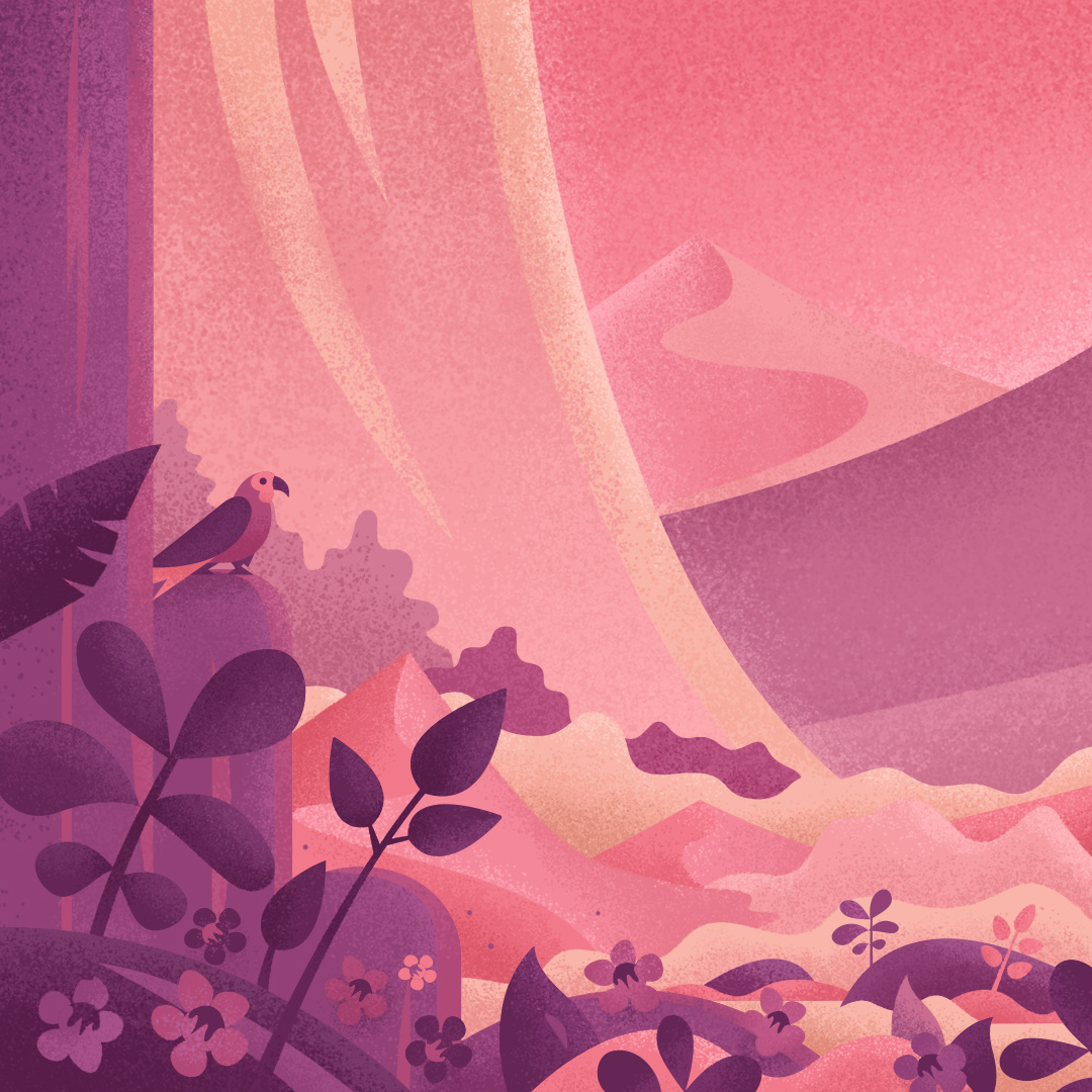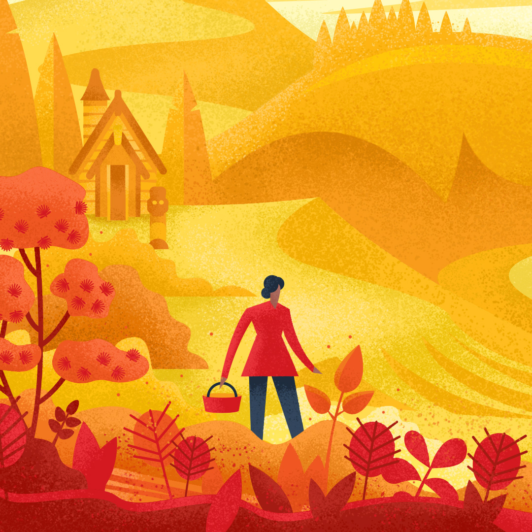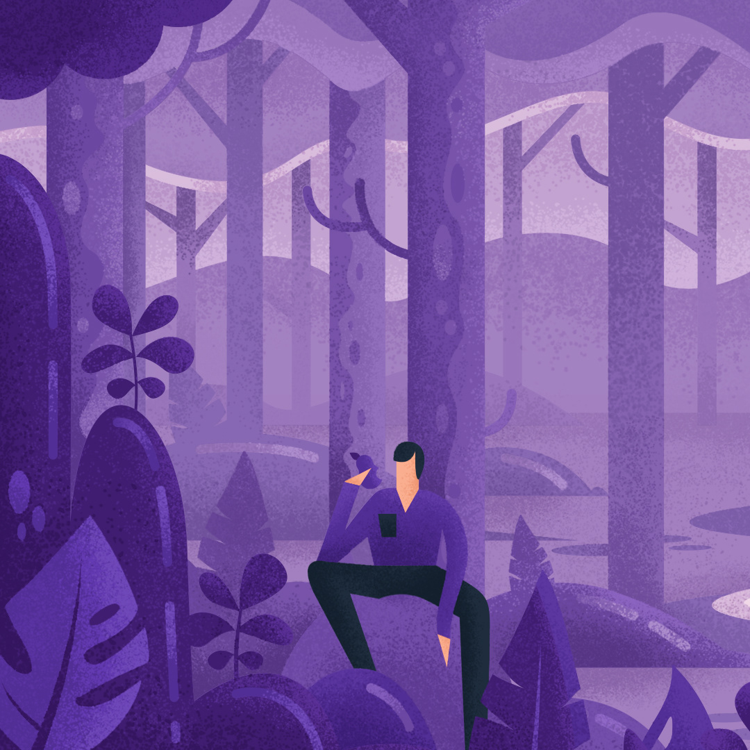
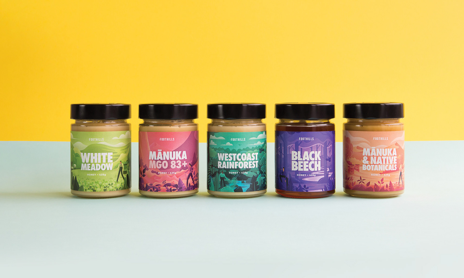
The Natural NZ Honey team set out to entirely refresh the Foothills brand strategy & style. Their aim was to refine their brand voice and move the label forward into a much more youthful, quirky and unique position.
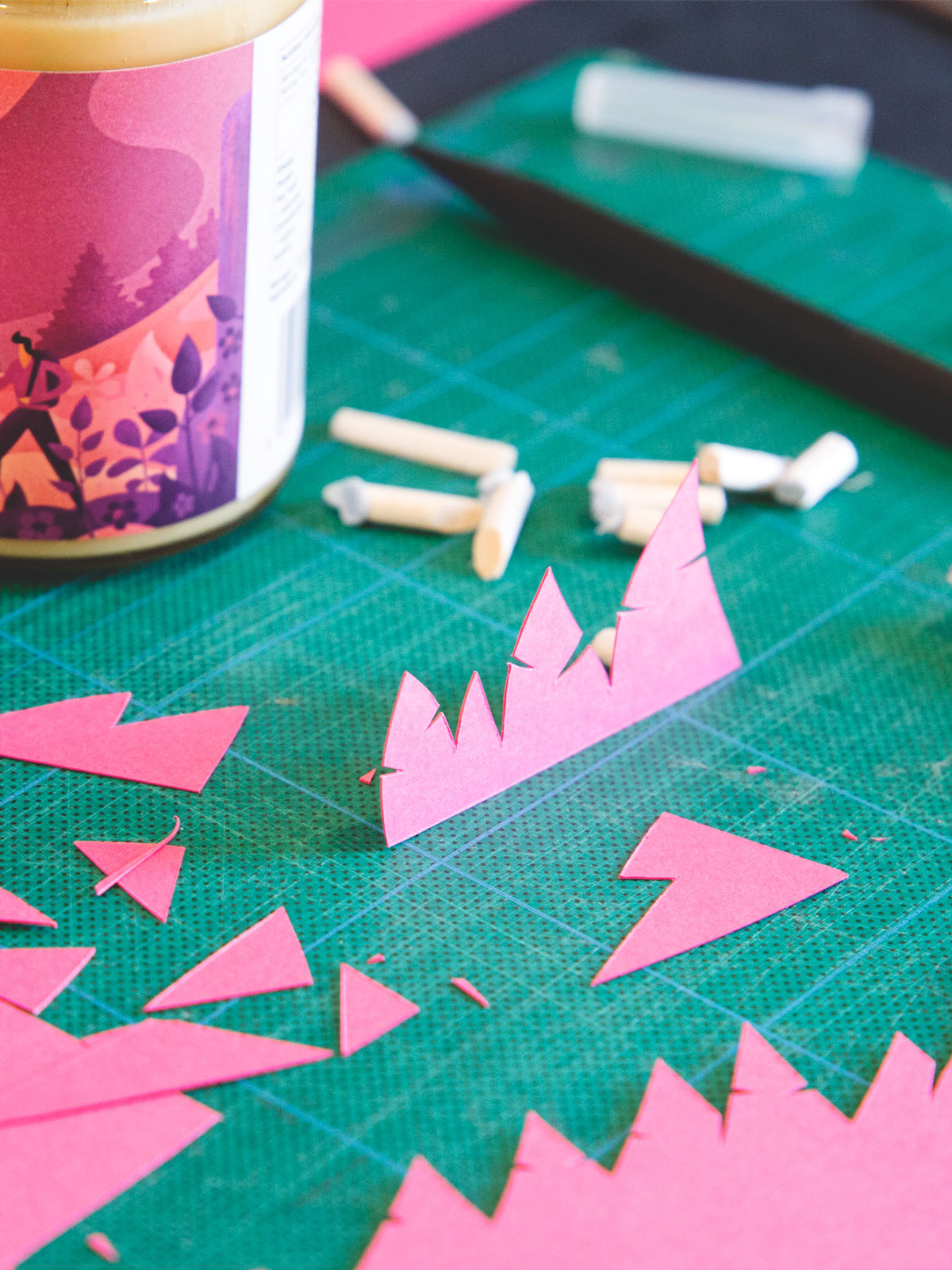
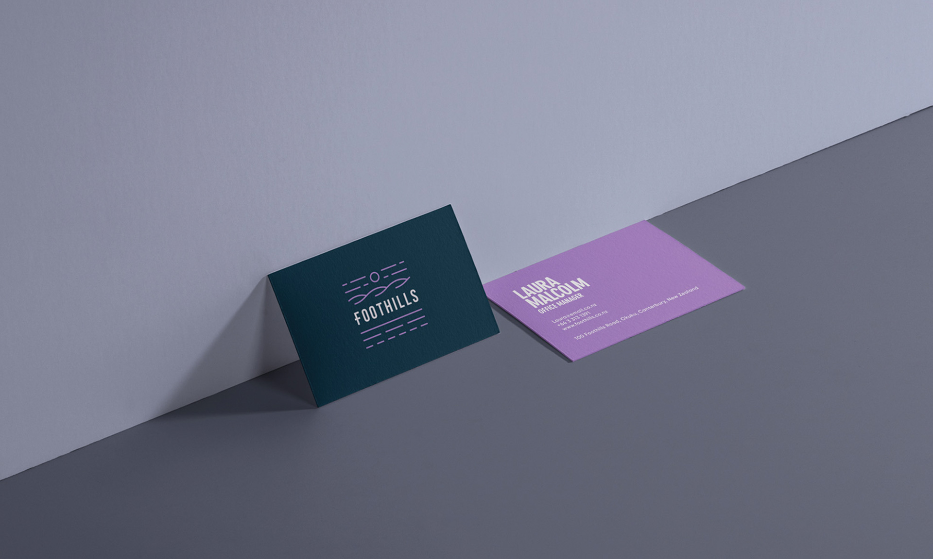
The primary focus of the re-brand was their labels, but before the hours of drawings and endless colour adjustments, we had to reimagine the logo with an equally playful and approachable presence.

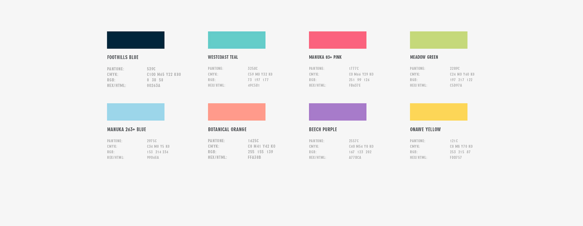
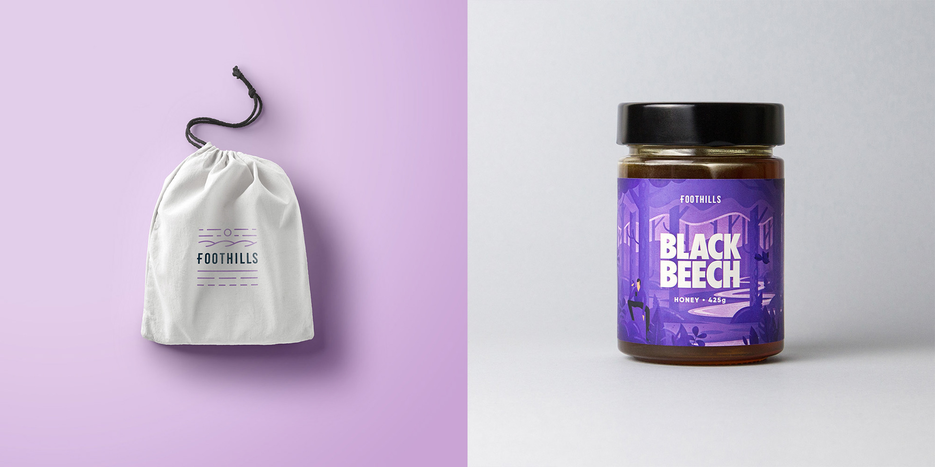
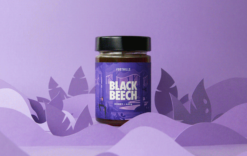
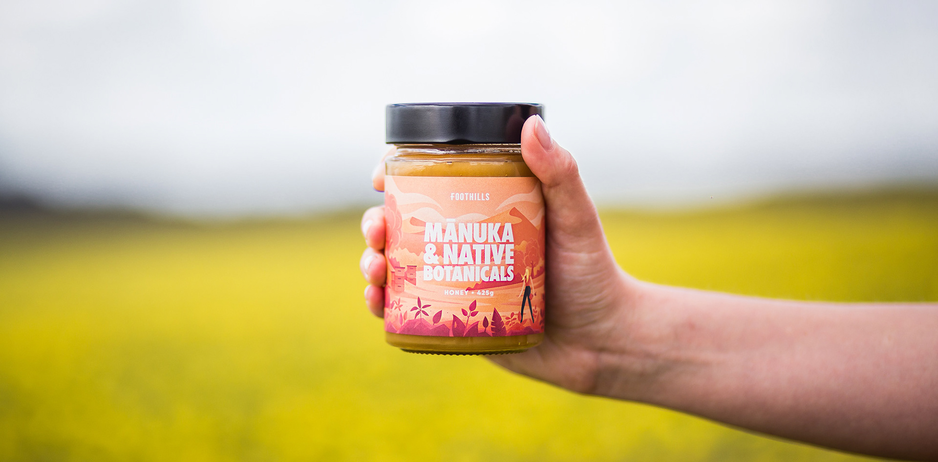
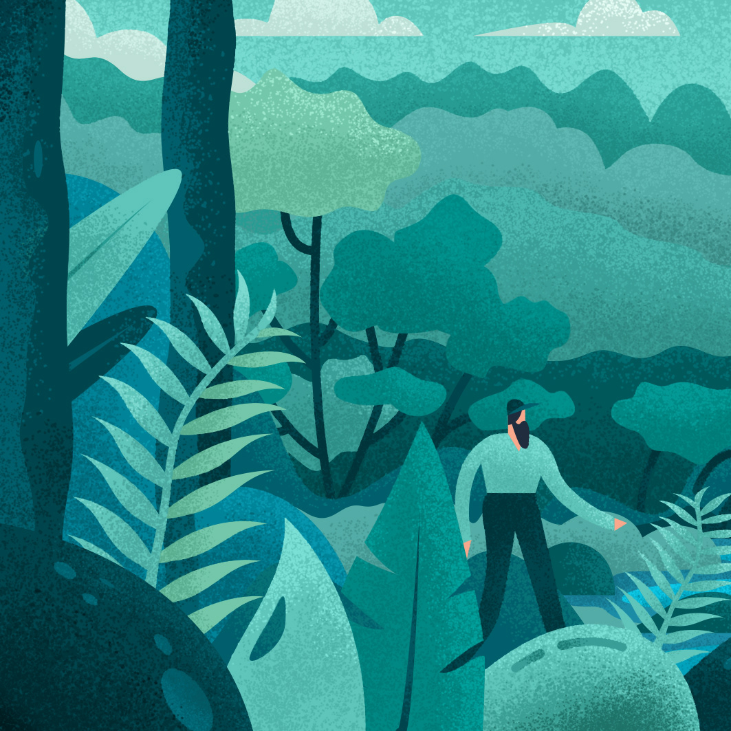
Bright colour and playful illustrations on newly sourced glass jars was the focus and the result is a honey label that stands out against competition on the shelf.